What Is a Color Palette in Interior Design?
A color palette in interior design is a curated set of colors used consistently across a room or entire home to create visual harmony, mood, and a cohesive aesthetic. Choosing the right color palette is one of the most important decisions in any interior design project — it affects how a space feels, looks, and functions every single day.
Whether you are designing a living room, bedroom, kitchen, or office, the colors you choose will define the entire atmosphere of that space.
Why Does Choosing the Right Color Palette Matter?
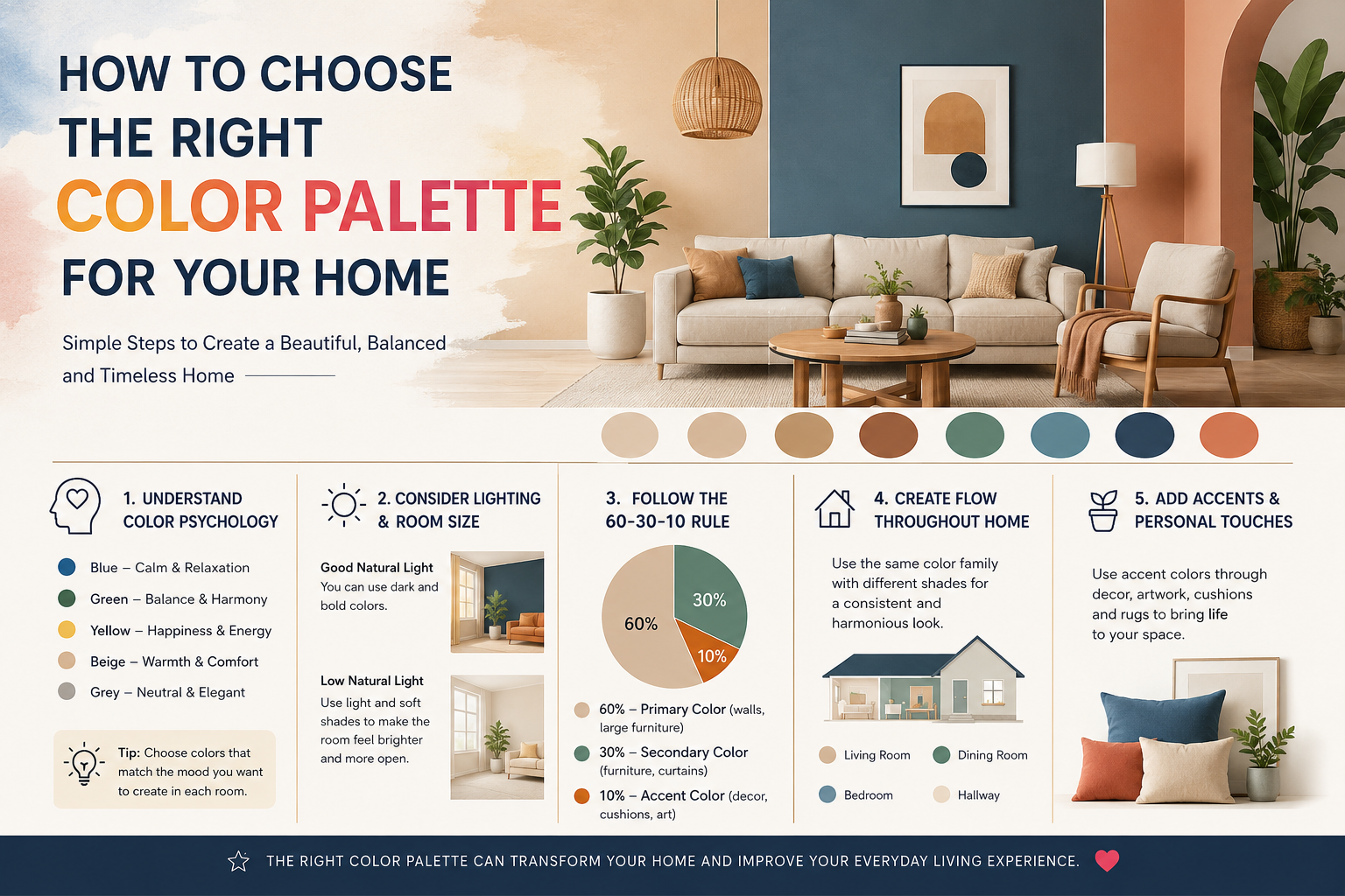
Colors have a direct psychological impact on how we feel in a space. Research in environmental psychology shows that:
- Blue tones promote calm, focus, and relaxation — ideal for bedrooms and offices
- Yellow and orange create energy and warmth — great for kitchens and dining areas
- Green brings a sense of nature and balance — perfect for living rooms and bathrooms
- Neutral shades (white, beige, grey) offer timelessness and flexibility
A well-chosen color palette can make a small room feel larger, a dark space feel brighter, and a chaotic area feel more organized.
Frequently Asked Questions About Choosing a Color Palette
How do I choose a color palette for my home interior?
To choose the right color palette for your home interior, follow these five steps:
- Start with inspiration — Look at furniture, artwork, or fabrics you already love
- Understand the 60-30-10 rule — 60% dominant color, 30% secondary color, 10% accent color
- Consider natural light — North-facing rooms need warm tones; south-facing rooms handle cool tones well
- Test before committing — Always paint swatches on your wall and observe them at different times of day
- Think about flow — Adjacent rooms should share at least one common color for visual continuity
What is the 60-30-10 rule in interior design color?
The 60-30-10 rule is a classic interior design principle that helps create balanced color schemes. Here is how it works:
- 60% — Dominant Color: This is your main color, usually seen on walls, large rugs, or major furniture pieces. It sets the overall tone of the room.
- 30% — Secondary Color: This appears on upholstery, curtains, accent furniture, or bedding. It supports and complements the dominant color.
- 10% — Accent Color: This is your bold pop of color used in cushions, artwork, vases, or decorative items. It adds personality and visual interest.
Example: A living room with soft grey walls (60%), navy blue sofa and curtains (30%), and gold or mustard yellow accessories (10%).
What colors make a room look bigger?
Light and cool colors make a room look bigger. The best colors to make a small room appear larger include:
- Soft white and off-white — Reflect the most light and create an open, airy feel
- Light grey — Modern and sophisticated without feeling heavy
- Pale blue or sage green — Cool tones that recede visually, expanding the perceived space
- Warm beige — Adds warmth while keeping the room feeling open
Avoid dark, saturated colors on all four walls in small rooms as they absorb light and make spaces feel enclosed.
How many colors should be in a room’s color palette?
A well-balanced room typically uses 3 to 5 colors. More than five colors can feel chaotic and uncoordinated. A simple and effective approach is:
- 1 dominant neutral color
- 1–2 supporting mid-tones
- 1 bold accent color
- Optional: 1 metallic or texture-based neutral (gold, silver, wood tone)
Step-by-Step Guide: How to Choose a Color Palette for Any Room
Step 1: Identify the Mood You Want to Create
Before picking any colors, ask yourself: How do I want this room to feel?
| Mood | Recommended Colors |
|---|---|
| Calm & Relaxing | Soft blue, lavender, sage green, warm white |
| Energetic & Vibrant | Orange, yellow, coral, bright teal |
| Luxurious & Elegant | Deep navy, emerald green, burgundy, gold |
| Fresh & Minimal | White, light grey, pale wood tones |
| Cozy & Warm | Terracotta, warm brown, burnt orange, cream |
Step 2: Analyse Your Existing Elements
You do not always start from scratch. Look at what you already have in the room:
- Fixed elements — flooring, tiles, built-in furniture (you cannot easily change these)
- Large furniture pieces — sofa, bed frame, dining table
- Architectural features — exposed brick, wooden beams, cornices
These elements should guide your palette. Pick colors that complement rather than clash with these fixed points.
Step 3: Understand Undertones
Every color has an undertone — a subtle secondary hue beneath the surface. This is why “white” is never just white. Common undertones include:
- Warm undertones — yellow, red, orange (creates a cosy, inviting feel)
- Cool undertones — blue, green, purple (creates a fresh, modern feel)
- Neutral undertones — balanced, works with both warm and cool palettes
Always check the undertone of your chosen colors against each other. Mixing a warm white with a cool grey can create an unintentional clash.
Step 4: Use a Color Wheel
The color wheel is your best friend in palette creation. Here are the most common color schemes based on the wheel:
- Monochromatic — Different shades and tints of the same color (e.g., light blue, medium blue, navy). Creates a serene, sophisticated look.
- Analogous — Colors next to each other on the wheel (e.g., yellow, yellow-green, green). Creates a harmonious, nature-inspired feel.
- Complementary — Colors opposite each other on the wheel (e.g., blue and orange). Creates bold contrast and visual energy.
- Triadic — Three colors equally spaced on the wheel (e.g., red, yellow, blue). Creates a vibrant, playful look.
- Split-Complementary — A base color plus two colors adjacent to its complement. Offers contrast with more balance than pure complementary.
Step 5: Factor in Lighting Conditions
Lighting dramatically changes how colors appear. Before finalising your palette:
- Test paint swatches in the actual room at morning, afternoon, and evening
- Natural daylight shows the truest color
- Incandescent bulbs add warmth — they enhance yellows and reds
- LED/cool white bulbs enhance blues and greys
- North-facing rooms receive cool, indirect light — warm up the palette with earthy or golden tones
- South-facing rooms get strong, warm light — they can handle cooler palettes beautifully
Step 6: Test Before You Commit
Never choose a color from a small chip alone. Here is how to test properly:
- Buy sample pots of your top 2–3 choices
- Paint A4-sized swatches on the actual wall (not paper)
- Observe the swatches at different times of day and under artificial light
- View the swatch next to your furniture and flooring
- Live with it for 48–72 hours before making a final decision
Room-by-Room Color Palette Guide
Living Room Color Palette
The living room is the heart of the home — a space for relaxation and social gathering. Best choices:
- Warm neutrals + earthy accents (beige, warm grey, terracotta)
- Navy + white + gold for a timeless, sophisticated look
- Sage green + warm wood tones for a biophilic, calming feel
Bedroom Color Palette
The bedroom should promote rest and calm. Best choices:
- Soft blues, lavender, and muted greens — scientifically linked to better sleep
- Warm whites and oatmeal tones — clean, restful, and timeless
- Deep jewel tones (navy, forest green, charcoal) for a dramatic, cosy retreat
Kitchen Color Palette
Kitchens benefit from energizing, clean-feeling colors. Best choices:
- White or light grey — classic, hygienic, and timeless
- Warm yellow or cream — evokes warmth and appetite
- Two-tone kitchens (e.g., white upper cabinets + navy lower cabinets) — on-trend and practical
Bathroom Color Palette
Bathrooms are the ideal space for spa-inspired palettes. Best choices:
- Cool white + grey + chrome — clean, modern, and spa-like
- Pale blue or seafoam green — fresh and calming
- Warm beige + natural stone textures — luxurious and grounded
Home Office Color Palette
Color can improve focus and productivity at home. Best choices:
- Muted green or blue-grey — reduces eye strain, promotes focus
- Off-white or warm white — keeps the space feeling fresh without distraction
- Deep accent wall in forest green or charcoal — adds depth and motivation
Common Color Palette Mistakes to Avoid
- Choosing colors from a tiny chip — Always test a large swatch on the actual wall
- Ignoring undertones — Mismatched undertones cause subtle but noticeable discord
- Too many accent colors — Stick to one bold accent per room
- Matching everything exactly — Coordinating is better than perfectly matching
- Forgetting the ceiling — The ceiling is the fifth wall; it influences the entire color experience
- Painting before buying furniture — Furniture is harder to change than paint
- Ignoring the flooring — Your floor color must anchor and complement your palette
Top Color Palette Trends in Indian Home Interiors (2025–2026)
Indian homes are seeing a shift toward:
- Earthy and terracotta tones — celebrating Indian craftsmanship and warmth
- Deep jewel tones — emerald, sapphire, and amethyst for a luxurious aesthetic
- Warm minimalism — off-whites, warm greys, and nude tones with natural textures
- Biophilic palettes — greens, browns, and natural wood to bring the outdoors in
- Maximalist accent walls — bold, patterned, or deeply pigmented feature walls paired with neutral surroundings
How Makan Interio Can Help You Choose the Perfect Color Palette
At Makan Interio, we understand that choosing the right color palette is both a science and an art. Our experienced interior designers in India help you:
- Analyse your space, lighting, and existing elements
- Create a custom color palette tailored to your lifestyle and taste
- Source the right paints, materials, and furnishings to bring your vision to life
- Avoid costly mistakes before a single wall is painted
Whether you are renovating a single room or designing an entire home, our team brings expertise, creativity, and attention to detail to every project.
Ready to transform your space? Contact Makan Interio today for a free color consultation.
Summary: Key Takeaways for Choosing the Right Color Palette
- Use the 60-30-10 rule for balanced, professional-looking interiors
- Always test swatches on the actual wall before committing
- Factor in natural and artificial lighting — they change colors dramatically
- Choose colors that reflect the mood you want to create
- Keep your undertones consistent across the palette
- Limit your palette to 3–5 colors per room
- Let your fixed elements (flooring, tiles) guide your color choices
Looking for expert interior design services in India? Visit makaninterio.com for portfolio, services, and consultation bookings.
Tags: interior design color palette, how to choose room colors, color scheme for home, 60-30-10 rule interior design, best colors for living room, bedroom color ideas India, interior design tips India, Makan Interio